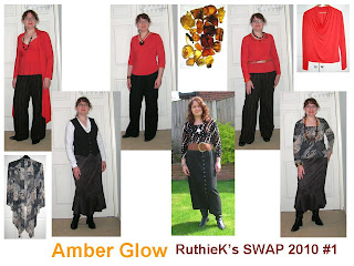
The Contest doesn't allow the combined garment photos for judging, but I love that snapshot of all the pieces.
So here are my combos (click to view full size):-
I like both collections, but I think the Botanical garden has used the colours better. I have olive, ivory, coral pink and spring green. Imagine it for a moment without the spring green and its lost its pep, which is frankly what happened to Amber Glow. AG uses black, chocolate brown, ivory and red orange and despite the use of the very strong red orange colour somehow does not have the same freshness and zing as BG.
I have cut out but not sewn up a wrap blouse in antique gold which should have been part of Amber Glow, maybe that would have added the required pep.
The green and pink are pretty much opposite each other on the colourwheel (OK not quite), so maybe the orange needed a contrasting colour as well. I would have been limited a bit by the stripe fabric used in one of the pairs of trousers which had a dark brown background and stripes in white, tan, yellow, and orange. The antique gold was a nod to the yellow.
I am now thinking about my newspaper collection, and whether just black/white/red will have enough pep to it without the addition of another colour e.g. emerald green, or whether becuase I have used black and white which are already a strong contrast, the red alone is enough.
I have had a good look though the current Collections at East and some of those do use something like black, white + strong colour, but they also use prints in the those colours. Maybe my newspaper collection is OK if I use plenty of prints and incorporate a bit more red into it.


2 comments:
I am always impressed by your ability to find coordinating fabrics for your swaps and putting entire wardrobes together. Great job!!!!!
Post a Comment